Wednesday, 23 December 2015

Colour Schemes - Interior Cover


To begin with I took the interior cover pages of my comic and experimented with different colour schemes. I did this to test whether a specific colour scheme would work better for my comic or if realistic colouration would be more effective. Below is my first colour scheme test which is a black and white / monochromatic test. 

The second test I tried was a complimentary colour scheme. This consisted of red and green hues as shown in the colour chart below. The example of this actual complimentary colour scheme is shown through the bones and dog bones below.

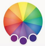
Another colour scheme I tried on my interior cover pages was an analogous scheme. Shown below is a colour wheel showing the variety of hues I used. I chose purple for this example so that there was a large difference between each colour scheme I chose to experiment with.


The final colour scheme I experimented with was a set of Triadic colours. These consisted of purple, green and orange hues, although this was an interesting combination and gave variety to the interior cover of my comic. Although throughout each colour scheme I prefer the a more realistic colour scheme. Due to this fact I have decided to match the hues in my drawings to the ones generally matched with each product. For example I will use a generic green colour for my tennis balls, because that is the colour normally associated with a tennis ball.

Tuesday, 22 December 2015

Lighting and Tone Development

Below is my first experimentation with lighting and tone. These have been created by cropping a small section of my interior cover designs, As you can see the image below shows a variety of grey scale tones. In this example I have not used any pure black shades, this was to get an idea of what the tonal range in my comic would look like without include black, and only using white, light grey and dark grey hues.


The second example I tried and experimented with in lighting and tone did include black. This noticeably increased the texture and also the difference between the tonal range not including black and the tonal range including black. When the black shading is added, the drawings look more aesthetically pleasing, and this is what I am aiming for. Due to this fact I prefer the second experiment instead of the first one.

Below is an example of a tonal range which includes much more black shading, and is somewhat off putting. With the large amount of black and limited white, the drawings look to dark and are displeasing to the eye. Therefore I will use a tonal range which includes black and white hues equally.

Monday, 21 December 2015

Rough Development - Sleeve Design

Below are images showing the development and processes I took to create my Sleeve design.This overall process took over two weeks to perfect and throughout creating my sleeve design I tired a variety of techniques and styles before reaching a final design.

Initial Planning of my sleeve started with making mood boards and sketching out ideas, but the first thing I actually made was a simplistic white, paper design of what my sleeve could look like. This was to figure out the size in which my actual sleeve design would need to be, but also start the beginning processes.

The next thing I did was start to plan out how the actually design I'd already planned would fit onto a A4 piece of paper. This was firstly draw in pencil into my sketchbook, and then with a fine liner I copied over my original lines. One the design was complete I scanned it into the computer and then printed it out on regular paper. This was done so that I could practice colour schemes and different techniques without ruining my original design.

Below you can see a example of some of the colours designed I tested on a print out. This was mainly to figure out what type of hues I wanted to feature on my title strip. As you can see, I tested blue, orange and green. The blue was designed to be somewhat of a contrasting colour against the yellow font. I also attempted to use an orange ink colour to get an monochromatic colour scheme. I also tired using different saturations of brown for the wood background colour. This proved to be difficult since I was using inks, and the colours didn't lighten.

Below is the version I created with water colours inks, one thing I didn't enjoy whilst doing this was the texture in the background wooden panels. Although it proved to be difficult to do everything else. While trying to colour in the vines and flowers, the green hues blended with the brown wooden colour even after it dried, making it hard to understand the design.

Below is the digital version I created, but this was printed on tracing paper to see the types of effects it would give. Surprisingly the effect looked excellent when held to a window or into the light, but the material the product was made of gave it it's faults. Unfortunately although the effect looked nice, the tracing paper design would never be able to hold and carry my comics.

Due to the fact the tracing paper idea was nice, but wasn't practically sound I re-printed my design onto card. This proved to be a good result, both in the effect it gave but also the sturdiness of the sleeve. Below you can see my final design, printed out and glued together.


Saturday, 12 December 2015

Product Sleeve Design

For my final piece I wanted to create a sleeve in which all my comics would fit. This would allow for easy transport, safety and decoration for my piece. The original idea for the sleeve was to design something like an ordinary envelope, although this was to plain and didn't 'promote' my final pieces in any way. Therefore due to this fact I decided to develop the envelope idea some more.

To begin with I made a large board on Photoshop containing different ideas of what the outside of my sleeve could look like. Because it was dog related I decided to keep within the subject matter of anything relating to dogs, therefore I included toys, houses and anything that could represent where a typical dog may venture.

After looking into the different ideas I could do, I decided to design and develop some of the ideas in my sketch book. These containing an envelop covered in dog toys, another trees and leaves over it, and a final one designed as if it were a dog house.

After refining my ideas I decided to go with the dog house design as it proved to be the best and also convey a message that my comics would be able a dog.

Once I had finalized the design I went into Photoshop and started to create a digital version of my sleeve design. Firstly creating the lines and then adding colour over the top, I used contrasting hues, for example orange and blue for my title. This was done to make my sleeve design pop and attract attention.

I then printed it out on card, and folded it appropriately. Once I knew it fit together properly and that the design was perfected I glued the connecting edges so that it was secure for my comic.

 This was the final product

Thursday, 10 December 2015

Own Type Creation

For my front cover I decided to make two different type faces. I firstly started this process by creating two sketchbook pages full of a variety of fonts. This gave me an idea of what type of font I would be aiming to create for my comics cover. Below are my four pages full of different font ideas.

Once I'd completed my various font design I started on my final type deigns. The first one I created was a bubble type lettering. This initially would be half of my finalized title.
After my first font was completed I started upon creating my second one. This would also be half of the finalized title, but it was specifically design to be previews as a smaller, less important typeface compared to my previously design bubble font.

Wednesday, 9 December 2015

Digital Typeface

Below are a selection of digital typefaces which I found and downloaded from DaFont. These were positioned on a Photoshop document and printed out. Beneath you can see the original Photoshop documents of all the types I gathered.

Printing out these variety of types I annotated around the edge of each printed page with the pros, cons, similarities and even differences between each font. Below is the finished annotated sheets.

Once I'd finished annotating I began to put some digitally downloaded fonts onto a draft I'd made of my work. This in turn helped a great deal, and gave me the ability to eliminate different styles of font which did not match the feel of my product. All of the following screenshots show only the placement of my title, without anything else on the front over. I do plan to add more, but at this stage I am only interested in how the typeface looks. Below is the front cover design I had created based on a draft, and re-made in Photoshop.

For the first example I've tried below you can see that the type I've sampled is a handwritten, sans serif font. I do in fact like the look this font gives. The opacity throughout this specific font gives a more organic feel, and lends itself to the fact that this is a small press / underground comix, something which is created normally by one person instead of a larger group.

Again, like the design above with the opacity showing through the type and giving a more hand-drawn feeling to my comic, I prefer this design instead of more computer generated typefaces.

With this font, the stylized display it has is very appealing, but sadly it looks as though it was created on a typewriter. Although the design of the font does look effective, it doesn't lent itself to the type of pure hand created feel I'm searching for. The style looks to mechanically created.

I'm not the biggest fan on the typeface you can see present below due to the fact it looks so bulky, and bold. Though the one pro about this type is the texture and chunks which are missing throughout the letters. This effect gives the type a less mechanical look, although it still looks to ' in your face ' compared to the other types I've favoured previously.

Below I placed a script typeface onto my cover, and quickly realized that this type of font did not fit well with the style of my comic at all. Therefore I will not be using a script font on my font cover. I also will not be using a script front on my front cover because it is less legible than a hand written one.